Sharp Tools
Sometimes it's really fun to see a project come together–to see all of the different stakeholders, skill-sets and tools combine to create a final product that has an impact. One of the things I most like about working in IT is that, very often, you get a higher-level view into projects than you would otherwise since, in the best case scenario, you're brought in early to go over technical needs and such.
Early this year, a study was conducted showing the impact of an increase of renewable energy by congressional district. You can find the study here, but the gist is that, under policies to reduce carbon emissions, we would see an increase in renewable energy. It turns out that rural districts come out way ahead under such a shift, to the tune of $17 billion dollars in direct revenue annually over the period looked at by the study (just over a decade). And that's only direct revenue, total economic benefit would be much greater. This would put renewables up there with major cash crops in terms of revenue for some districts.
This is absolutely critical information to have. The transition to clean energy has to happen quickly. There is the stubborn prevailing notion out there of a "green premium" (if it's green, it must be more expensive) that hasn't been accurate for a long while. The more data that we have showing the economic benefits of renewables, especially to rural communities the better, especially since rural districts lean conservative.
We wanted to help translate the study into per-district and per-state handouts for volunteers so that they could give this information to their representatives, but the challenge was that we had a conference coming up within a couple of weeks, so we needed to figure out how to put something together quickly. For me the main sticking point was PDF generation. I had experience with building PDF reports in Java and Ruby, but the workflow was quite involved to get something polished with the frameworks I've used. Often the frameworks have their own unique syntax, where you're either placing blocks with exact x/y coordinates (think the old turtle program), or learning the frameworks version of layout containers. For example, here's some beautiful iText code:
Text text = new Text("This is my text.");
font = PdfFontFactory.createFont(FontConstants.HELVETICA_BOLD);
text.setFont(font);
Paragraph para = new Paragraph(text);
document.add(paragraph1)

AreaBreak aB = new AreaBreak();
document.add(aB);
This is just to add text. Never mind if you need to add layouts or detect page breaks or add tables or footers or embed graphics. Now granted, this is the Java example, and Python versions are less verbose, but the point is you still have to learn the objects and such and I wasn't sure I had time.
Another option was to use some Salesforce integrated tools, but those would involve importing study data, which would involve defining new objects, fields, and reports, building Word templates, and creating the workflows that would transform those templates into PDFs and place them somewhere we could get to them. Again, this was a tall order for our time-frame.
Wouldn't it be nice if I could just use HTML and CSS? HTML and CSS are already great at this, and I already know how to use that. I debated making a web page that would just show this data (and eventually did for other reasons), but we wanted easily printable handouts and printing a web page is clunky. While thinking through this I remembered seeing a post from Practical Business Python where they do something almost exactly like this. As an aside, Practical Business Python (PBP) is a wonderful site, full of very.. well.. practical articles like this. Not cutting edge tech, not why Python rocks, or framework x sucks, just stuff like this; how to use Python to send an Excel file, or pivot data in Pandas, or read an HTML table from Python.
Basic Overview
Using this article as a starting point (as well as this other one when I decided to use PDFKit for PDF conversion) I started working towards a pipeline solution to generate our reports which, aside from a few small snags, turned out to work great. Here's what it looked like (this is basically the same as the chart from the PBP article, but I wanted to highlight the writing out and reading in of generated images):
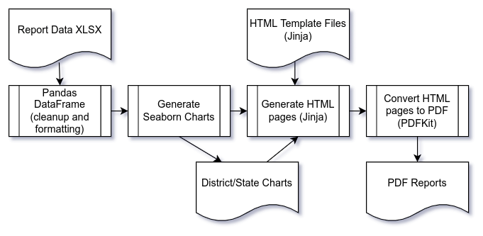
Now I understand if you're suspicious of any process that you need a flowchart to outline. I am too, which is why I took a hard look at other options. But the individual pieces here are well-worn solutions to what they're doing and familiar to many people working in the Python space. Pandas and Seaborn are go-to tools for reading, cleaning and visualizing data, Jinga, HTML and CSS are familiar to anyone working on web endpoints. If you take out the chart generation and PDF conversion steps this could be a typical web request workflow.
One of the great benefits of the setup was that I could very quickly iterate on the design to get it to match our sample from marketing. All I had to do was make a plain HTML page with sample data and charts and point a browser at it. Then it was a matter of making adjustments and hitting refresh until everything lined up and I could turn it into a template. Jinja is really nice for this. The difference between an HTML file and a template file is basically just adding template tags {{}} to variables you're passing in (you can do loops and if statements and such as well). So:
<span>Direct Economic Benefits: Nebraska-03<span>
becomes:
<span>Direct Economic Benefits: {{district_name}}<span>

or

<img src="../images/dist_revenue_ne03.png" />
becomes:
<img src="../images/dist_revenue_{{district}}.png" />With other PDF workflows I've used you'd have to make adjustments and then run the entire process to build the PDF and see what happened. That slows things down more than you'd think, especially early on when you're first learning the library. Likewise embedding images is usually more involved than you'd think, so you spend a lot of time iterating on that.
Outline
When it was all said and done I had about 150 lines of Notebook code to run through the steps outlined above. I'll be the first to say that lines of code doesn't tell you much really (you can easily have a 500 or 800 line program that's clearer, more maintainable and better than a 200 line program), but I do think it helps illustrate that this kind of solution doesn't need to be overly involved or complex and the final solution was more concise than I would have guessed going into it. The basic steps look like this:
disclaimer: this is truncated and very much not formatted well (no PEP8 here), to try to keep things brief
Read in summarized data, clean and filter:
district_data = pd.read_excel('./data/RURAL_ECON_RESEARCH.xlsx', sheet_name='Figure 1 District Data')

district_data['long_name'] = district_data.apply(lambda r: f"{r['state_name']}-{r['dist_number']}", axis=1)

district_data.dropna(subset=['District'], inplace=True)
district_data.rename(columns=clean_columns, inplace=True)
district_data.rename(columns={'o&m_wages': 'o_and_m_wages'}, inplace=True)
# ... more cleaning
Compile data for charts
Building charts turned out to be easier with dictionaries in this case given that I wanted to drop colums that didn't have a value in a given district
district_chart_data = [
    {
        'district': r['district'], 'title': r['long_name'],
        'data': [r[field_name]
            for field_name in data_fields if r[field_name] > 0
        ],
        'labels': [label
            for field_name, label in chart_map.items()
            if r[field_name] > 0
        ]
    }
    for _, r in district_data.iterrows()
]
Build charts
Now iterate through our chart data. Note that the plt.clf() was a tricky thing to figure out. I'm not all that familiar with matplotlib, but without calling clf() data would be retained between chart instances
sns.set(rc={"figure.figsize":(12, 6)})
sns.set_style("whitegrid")
# define styling
palette = {'Construction Wages': '#9BC23B',
    'Land Lease Revenue': '#5A7931',
    'Tax Revenue': '#0081C7', 'O & M Wages': '#DAD9D5',
    'Total Annual Revenue': '#7A7776'
}

for dist_data in district_chart_data:
    plt.title(f"Rural Economic Benefit from.. {dist_data['title']}",
        fontsize=20, fontname='Ubuntu', color='#0081c7'..);
    plt.xlabel("Revenue Category", fontsize=18, fontname='Ubuntu'..);
    plt.ylabel("Annual Revenue ($ in millions)", fontsize=18..);
    dist_chart = sns.barplot(x=dist_data['labels'],
        y=dist_data['data'], palette=palette);
    fig = dist_chart.get_figure();
    fig.savefig(f"./images/dist_revenue_{dist_data['district']}.png");
    plt.clf();
Write out HTML and PDF files
# PDF settings (footer is a separate template):
pdf_options = {
    "enable-local-file-access": None,
    "page-size": 'Letter',
    "margin-top": '0.75in',
    ...
    "encoding": "UTF-8",
    "--footer-html": "./templates/rural_impact_footer.html"
}

# tell Jinja where our HTML template files are
templateLoader = jinja2.FileSystemLoader(searchpath="./templates/")
templateEnv = jinja2.Environment(loader=templateLoader)

# loop through our study data, passing values into the templates
for _, r in district_data.iterrows():
    output_text = template.render(**r.to_dict())
    # write HTML
    with open(f"./html/rural_impact_{r['district']}.html", 'w') as f:
        f.write(output_text);

    # write PDF
    pdfkit.from_file(f"./output_html/rural_impact_{r['district']}.html",
        f"./pdf/RuralBenefit-{r['long_name']}.pdf",options=pdf_options);
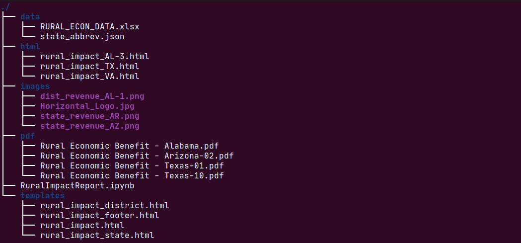
After several minutes the charts, HTML files and PDFs would all be written out like this (this is just a sample):
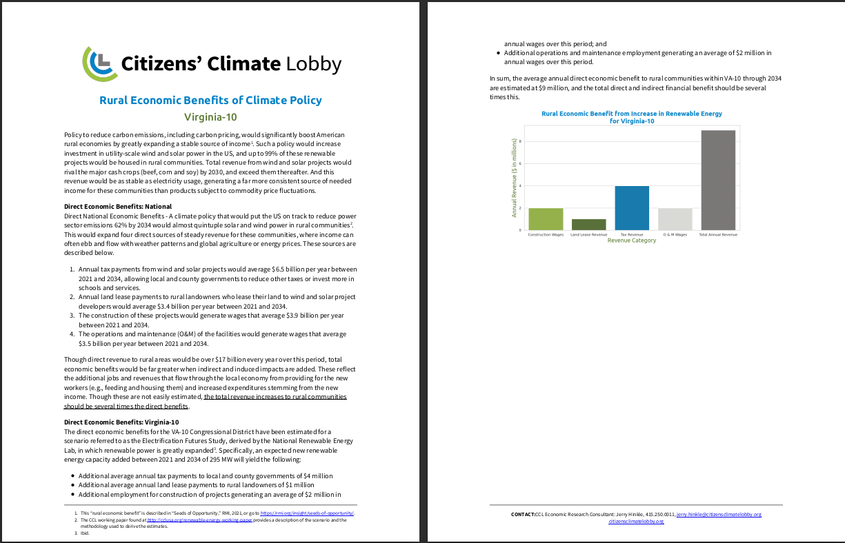
And we have nice styled PDFs ready to upload to a place that people can access them:
Downsides and Rough Edges
As much as it worked out in this case I certainly wouldn't say that this solution was without it's issues, or executed perfectly. When looked at from several dimensions it's very sub-optimal. For one thing there's a bunch of duplication. You're writing out charts only to pull them into PDFs and throw them away. Ditto the HTML files which are also just an intermediate step. I looked at writing both directly into the PDFKit conversion step (there's a pdfkit.from_string() method) but ran into issues with how to reference the images and quickly gave up because I liked having the HTML files for troubleshooting anyway.
Also the entire process takes several minutes to run, and it's set up as an all-or-nothing process that has to be run locally. It would be better to throw this in a Flask endpoint and make it an on-demand process that people could hit and download as needed rather than bulk uploading reports to Google drive. All of this wouldn't be too tough to add but again, the constraint here was time.
Lastly HTML to PDF isn't perfect. Your browser doesn't match a PDF with fixed margins and page-breaks and such. Likewise footers are weird to implement. You lose some fine-grained control doing things this way. Also, although PDFKit is awesome, as is the wkhtmltopdf utility that it wraps, getting those all set up so that file permissions were in place and fonts were available and such wasn't painless.
General Thoughts
Rough edges aside, I really liked this solution, and I'm very grateful to Chris Moffitt and Mark Nagelberg for the articles they made on the topic. Combining these tools felt very much like "clicking" together pieces to relatively painlessly solve a complicated problem. Even though I think the Linux notion of "sharp tools that do one thing well" can be overused and over-hyped (and maybe isn't even true of Linux anymore or a goal we should have anyway) it felt like what was happening here.
Having discreet steps also really helped me out when we pivoted to making an interactive map for the study. Since the data import and cleanup step was a stand-alone process, I was able to use that step to update a geojson district file that was used for the Mapbox visualization.
Maybe this whole process was something that would have been obvious to other developers and occurred to them right away, but it was striking to me. Maybe it was striking to me because I'm newer to Python, or because of how tough I remember PDF work being back when I worked in Java. Anyway, I hope this is useful to someone else who runs into this type of use case.